Understanding Color Contrast In Photography In 10 Easy Ways
We are attracted by some colors and repelled by others. Some arose as an eye-pleasing experience while others are, well not so attractive.
If you could understand the art of using color contrast photography, playing with the viewer’s mood would be easy for you in a photography career.
You surely won’t be manipulating them like sci-fi technology, but we can assure you that you will be imprinting your work in their heads. Eventually helping your career scale.
In this article, we will help you learn everything related to contrast in photography techniques and the right ways to use it. Here are the 10 Best Techniques for using color contrast in photography.
But before proceeding, let’s answer some of the most common questions about the use of color contrast in photography techniques.
What is Color Contrast in Photography?
Contrast basically means difference. Color Contrast in photography techniques is the difference between warm and cold colors shown in a single frame. These are the colors that are opposite to each other in the color wheel and often are complementary to each other.
Difference between Tonal and Color Contrast
While we are on the topic of photography techniques and growing your photography career, you may also know about the two types of contrast that you can use in an image.
Tonal Contrast
Tonal contrast is the difference between the tones, that is the lightest and the darkest tone within an image. The following photography techniques don’t have anything to deal with the colors and hue within an image. More specifically, tonal contrast works with black, white, and grey shades.
Color Contrast
While Tonal contrast deals with the tones of an image, color contrast in photography techniques is all about showcasing the different contrasting colors in a complementary manner. The following contrast has nothing to do with the dark or the bright side of an image but only deals with colors that are contrasting.
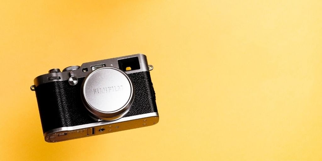
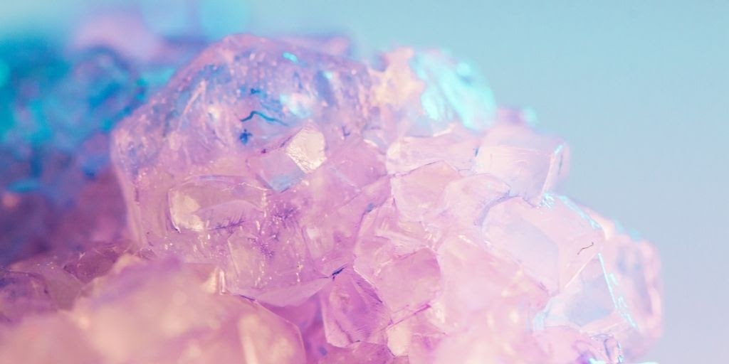
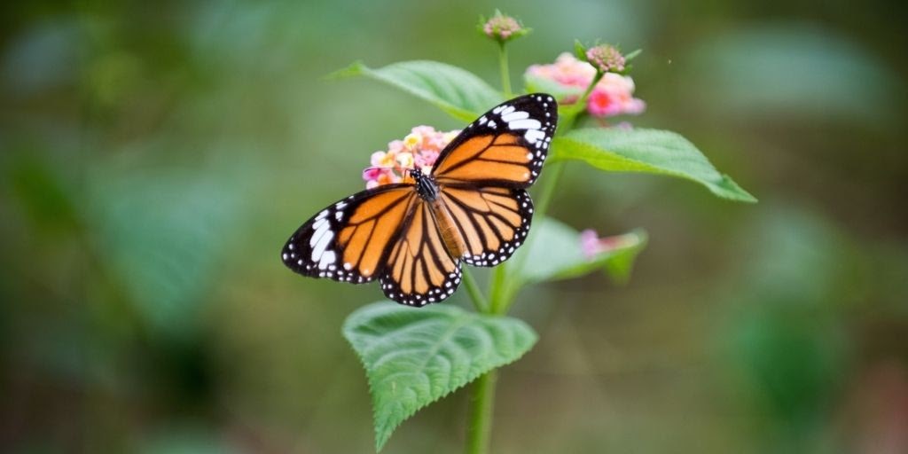
Now, this contrast can be as obvious as the camera image above or as subtle as shown in the image below.
Remember not to use both, Tonal and color contrast as the primary contrasting element. Use one as your primary style and the other in a much subtler, un-catchy way.
Best Techniques For Using Contrast in Photography
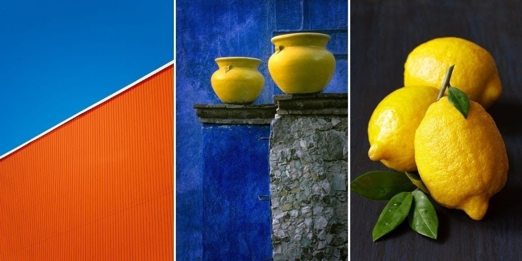
1. Use Complimentary Color
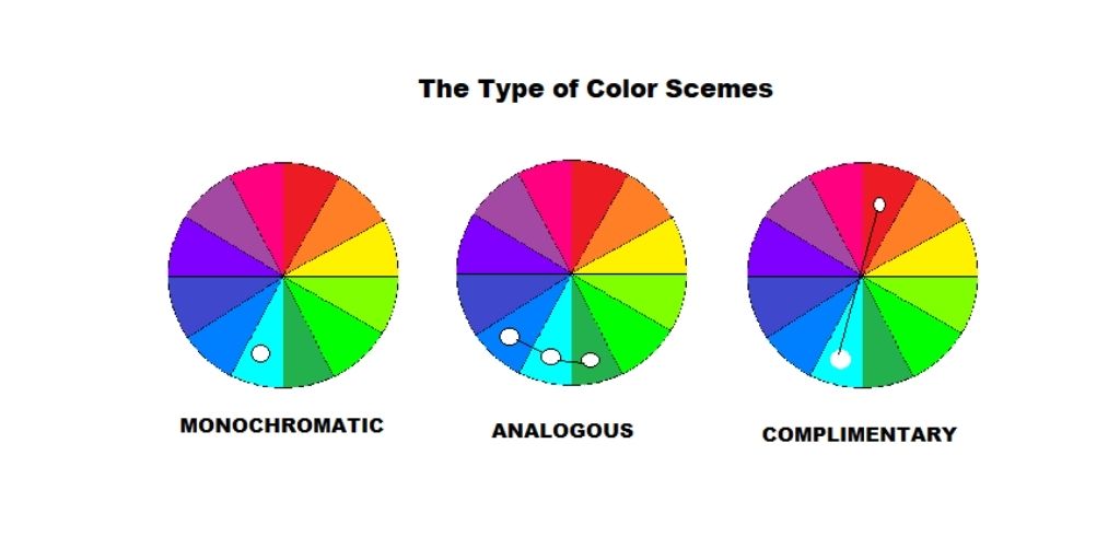
To understand color contrast in photography techniques, look at the above color wheel and check out the colors that are opposite each other. They are completely different yet complement each other.
Use the wheel to familiarize yourself with color contrast in photography techniques. To start with, we recommend you take a minimalistic approach. Find objects with complementary colors, and you will be all set to capture a picture-perfect presentation.
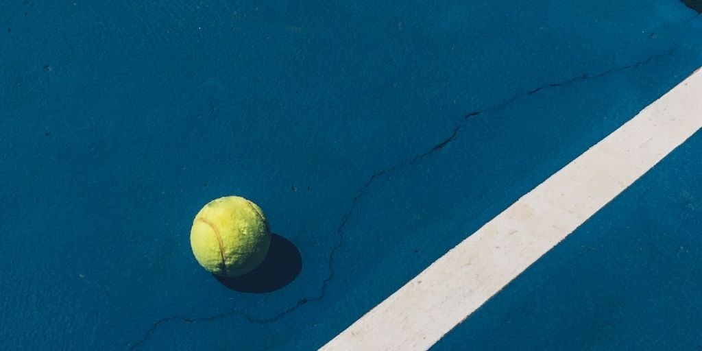
The above image clearly depicts the contrast between a yellow ball and the court. Similarly, if you are just starting out, look out for such day-to-day contrasts and start capturing them.
2. Understand the Dominant and Receding Colors
Color contrast in photography techniques involves combining two polar opposites. You would use warmer and cooler colors together. Hence, you need to know a core fact about them.
Warmer colors, like Red, yellow, orange, etc., reach our eyes faster than colder colors, like blue, green, and purple. This means that when used together, warmer colors grab the attention and focus first.
By adding the right color, temperature, and contrast, you can create a sense of depth in your image.
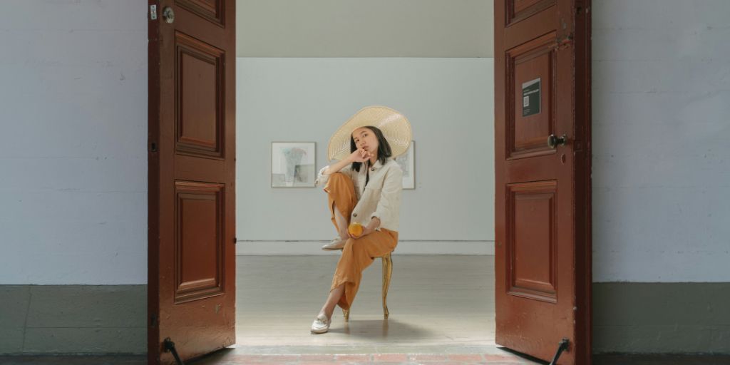
3. Start with Two Colors in the Frame
Understanding color contrast in photography techniques to the fullest takes time and experience. But to get your creative juices running, start with two colors contrasting. Pick an object with a singular color and look out for the contrast. Do this several times and start exploring what works best for you.
4. Do not Put in more than Three Colors
While playing with colors is intriguing, too much of anything can turn out to be bad. Stick your dial to three or less than three colors and you will be all set to get the best images.
Moreover, experiment with bold eye-catching colors rather than going subtle at the start.
If proposing model photography, decide on an outfit that stands out and brings contrast on its own.
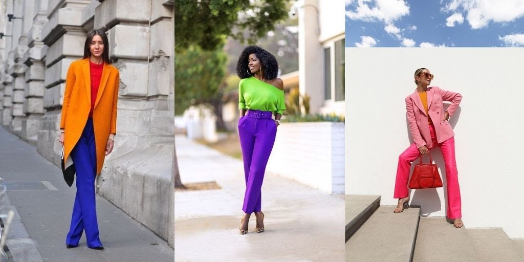
The contrast of the outfit with the background still makes the model stand out in the first two images (from the left), whereas the last image on the right struggles to stand out due to too many colors being combined.
5. Use Color Contrast and Composition in photography techniques
While you are learning one of the best photography techniques, never forget the other. A much better rule you could follow is to combine them and get the best results. Moreover, use contrast and composition techniques together.
Both are very important, and they serve one common goal only: Catching the viewer’s attention. Some common composition techniques are the Rule of thirds, frames, rule of space, golden ratio, etc.
6. Look For Natural Color Contrast
One easy photography practice that we highly recommend you try out regularly is stepping out of your studio and doing unplanned shoots.
Especially if you have found a new interest in learning color contrast in photography techniques, step out and find contrast in nature or your surroundings.
Wiring your mind to observe the contrast in the right way is crucial for a photographer.
Look out for opportunities and create an album based on Radom shoots of color contrast in photography.
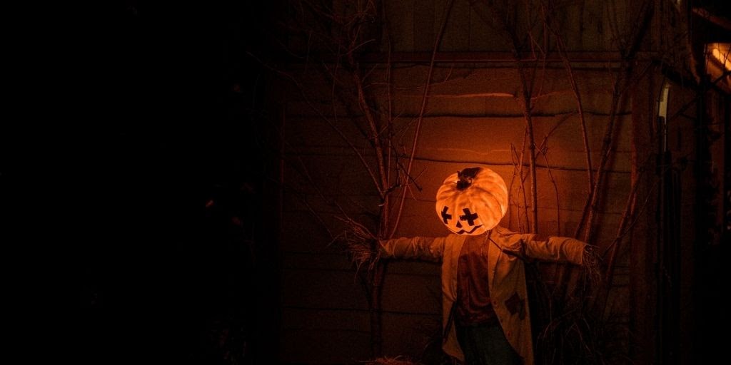
7. Use Color Contrast to Highlight your Subject

As said above, the main purpose of color contrast in photography techniques is to make your subject stand out in the frame. Hence you can even use it to highlight your subject. Choose the background and colors in the frame very consciously. Ensure that while you are trying to bring attention to the subject, the props used aren’t eye-catching.
8. Be Dramatic With Framing
In order to stand out, you need your images to be different, attractive, and if not more a little dramatic. Pop in contrast and different elements.
Use props that complement your overall image and make it look naturally perfect. Color contrast alone would be enough to catch the eye, but the composition and framing would make an image memorable.
9. Break a Monochromatic Palette
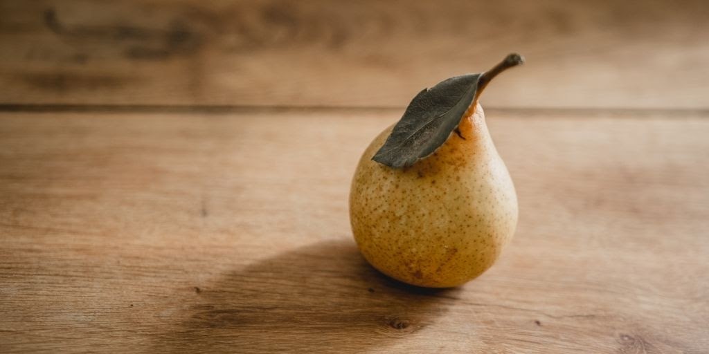
According to us, the most beneficial move in the above image was adding the leaf. The table and the pear share a monochromatic palette, but the dark leaf breaks the palette and makes the subject stand out.
The point we are trying to share is to try breaking a monochromatic palette by adding subtle contrast to it.
You need to remember that contrast shall not always be as bold or direct. Using it subtlety can also help you out in getting an amazing result.
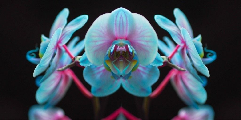
10. Use Colors to Create an Abstract Photo

An abstract image has a minimum number of components. Using color contrast in photography can make an image more fulfilling yet minimalistic.
You can follow the same rules as discussed above. However, this leaves a lot of negative space, as we are trying to capture an abstract photo.
Bonus Read
While we have discussed some of the Best techniques for using contrast photography, we would like to share one additional tip that can help you get your desired result: editing your image.
PixelPhant is a product photo editing service that helps eCommerce and photographers worldwide with their photo editing requirements. Hence, we totally understand the importance of editing in your photography career.
Make sure that before you showcase your work to the world, you remove the dust, flaws, and unrequired objects from the frame. Also, ensure that you set up the tone and temperature of your image in favor of your contrast.
Frequently Asked Questions
1. What Is Contrast In Photography?
Contrast in photography refers to the difference between the lightest and darkest areas of an image. It’s what creates textures, highlights, shadows, and colors, making each element stand out. Contrast is a key element in photography, helping to define and separate objects within an image.
2. What Are The Types Of Contrast In Photography?
The seven common types of contrast in photography include:
– Color Contrast
– Tonal Contrast
– High Contrast
– Low Contrast
– Conceptual Contrast
– Textural Contrast
– Compositional Contrast
3. What Does Contrast Do In Photography?
In photography, contrast determines the number of shades present in an image. It plays a major role in shaping the overall look and feel of a photo.
Here’s how it works:
A low-contrast image may still have details, but it often looks flat and lacks depth. In contrast, a high-contrast image can lose some color details, giving it a simplified, almost cartoon-like or poster-style effect.