Why Shadows, Textures, and Color Balance Matter in Product Photos?
Ever scrolled through a product catalog and instantly felt drawn to one image over another?
It’s not just about the product but how it’s photographed.
The depth of a shadow, the crispness of a fabric’s texture, or the precise tone of color in product photos can achieve or fall short of that first impression.
So, when a customer can’t touch or feel the product, your photo itself becomes the product.
To attract customers, your product photography especially shadows, textures, and color balance needs to be a game changer in eCommerce.
Here’s how it works and why you can’t afford to ignore it.
Table of Contents
Shadows
Why Shadows Matter in Product Photos?
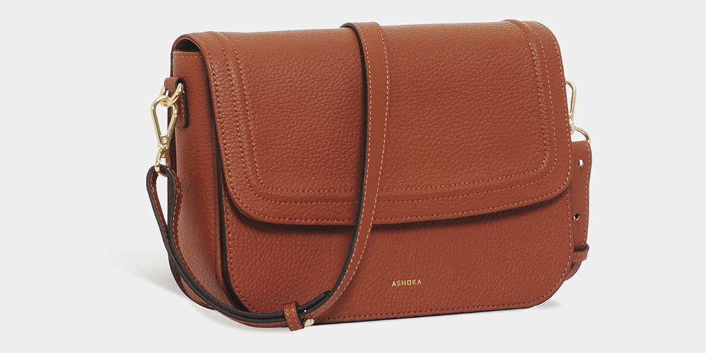
Shadows create a visual hierarchy and offer a natural contrast that helps the subject pop. If you know how to play with them, shadows can turn out to be a great advantage.
Moreover, shadows provide a sense of scale and realism. A product without any shadow seems artificial and looks like wallpaper instead of an original product.
A tiny shadow adjacent to your product would do a lot to make it look natural.
Types of Shadows
Natural Shadows
The natural shadow effect works best for product images. They are the ones that are formed by placing an object in front of a light source.
This would block the light, and the shadow is created adjacent to the products.
Drop Shadows
Drop shadows are software-generated shadows. They are not formed originally when a product is placed on a surface.
They are generated with the help of the shadow adding process after the images are actually clicked, and then cut out with the help of software like Photoshop.
Reflection Shadows
Reflection shadows are formed when the product is placed on an extremely shiny or polished surface.
As a quick fix, reflection shadows are added in post-production work, especially in product catalogs or white-background marketplaces like Amazon.
Cast Shadows
Backlighting a product creates cast shadows in front of it. While these shadows can add a creative touch, especially in fashion shoots or lookbooks but they’re not ideal for every type of product shoot.
For standalone product shots, cast shadows can distract from the item and take up valuable space.
That’s why they’re generally avoided in clean, eCommerce style photography where the focus needs to stay entirely on the product.
Professional photographers recommend using soft shadows instead. Soft shadows enhance the product’s appearance without overpowering it, making the image more visually appealing and persuasive to potential customers.
| Note: Use soft shadows for a clean, professional look. Save dramatic cast shadows for creative or editorial photography. |
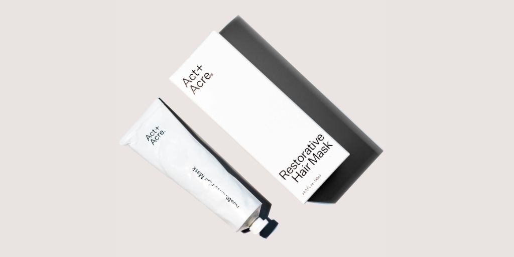
Textures
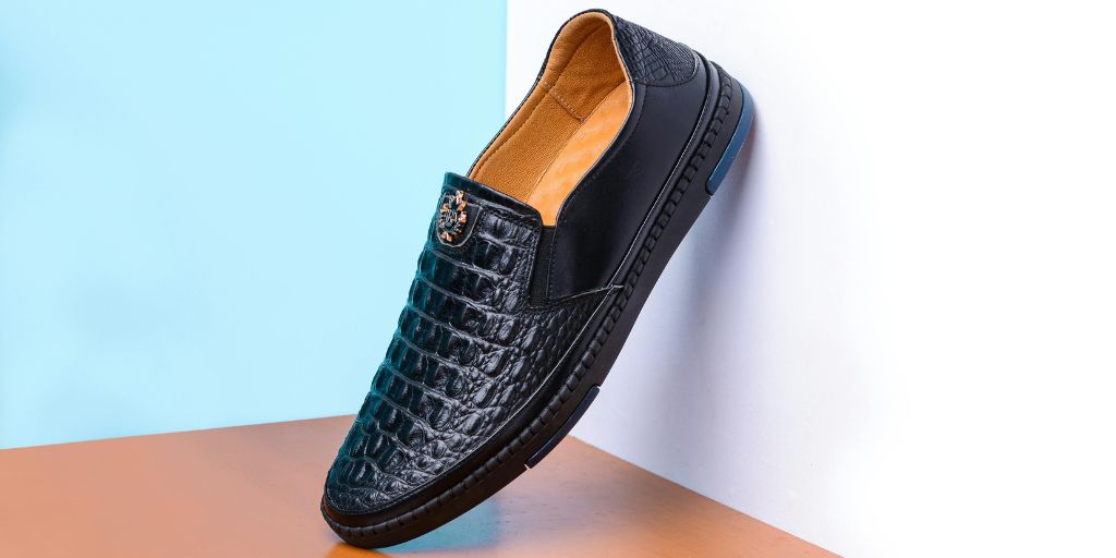
While visuals can’t replicate the feel of a product, they can evoke it if textures are captured correctly.
Textures bring tactility into the frame, helping customers imagine what it feels like to hold or wear that item.
How to Highlight Textures in Product Photos?
Directional Lighting
Lighting from the side casts shadows that enhance small surface details like fabric weave or embossing.
Contrast Control
Using contrast selectively in post-production can amplify the perception of roughness or smoothness.
Hard Light
Use a hard light to create intense contrast and bring out intricate patterns, which is ideal for jewelry, metal, or engraved items.
Macro Photography
Getting close to small products like cosmetics helps showcase their fine textures and finishes.
However, too much texture can also backfire, especially if it’s inconsistent with your brand aesthetic.
That’s why outsourcing to a professional eCommerce photo editing company helps ensure textures are highlighted tastefully and consistently.
Color Balance
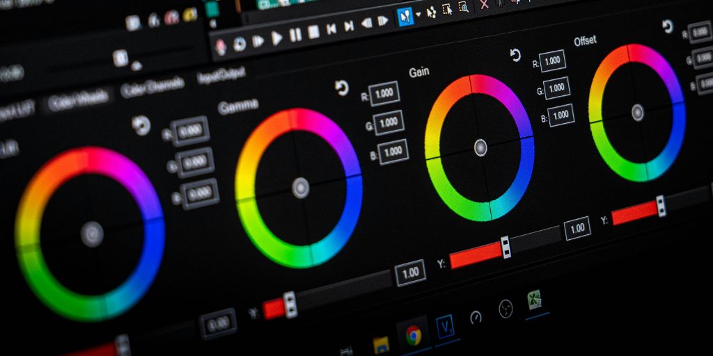
Color balance refers to the equilibrium of colors in an image, ensuring that colors are rendered accurately and harmoniously.
A red shirt that appears maroon on screen? That’s a return waiting to happen.
Why Color Balance Is Crucial in Product Photos?
Accuracy = Fewer Returns
According to Shopify, color inconsistencies are among the top reasons for product returns in fashion and beauty categories.
Brand Consistency
Your product pages, social ads, and email campaigns should show the same shades. Any deviation dilutes trust and reduces perceived professionalism.
Visual Harmony
Color balance helps different product shots look cohesive, especially when placed side-by-side on eCommerce platforms.
How to Use the Color Balance Technique
Use Neutral Backdrops
It helps eliminate color casting that can distort product hues.
Custom White Balance
You can set your camera using a gray card or manual white balance feature.
Consistent Lighting
Stick to one lighting temperature per shoot. Mixing daylight and warm bulbs can throw off your color accuracy.
Post-Processing
Fine-tuning RGB channels and correcting white points is a non-negotiable step.
Tools like Adobe Lightroom or outsourcing to a photo retouching service can ensure your product images stay true across your entire catalog.
The Product Photos Workflow
When shadows, textures, and color are all accurate, the product photo becomes what UX teams call a “confidence builder.”
According to Baymard Institute, perceived realism in product photos correlates directly with time spent on PDPs and lower bounce rates.
The combined effect:
- Shadows make the object real
- Texture makes it feel tangible
- Color makes it match the expectation
Here’s how professional photographers combine all three elements to create conversion-boosting images:
Plan Lighting First
- Choose your key light (softbox, window light, strobe).
- Add reflectors or fill light to reduce harsh shadows if needed.
Position Your Product Thoughtfully
- Consider texture placement. How does the fabric fold? Where do the shadows fall?
Review for Consistency
- Compare with previous product shots. Are colors and shadows aligned? Is the texture flattering?
- Add or refine shadows if needed.
- Use clarity/contrast to subtly enhance texture.
- Adjust white balance for uniformity across your store.
| Pro Tip: Brands working at scale often don’t have time to edit every image manually. This is where outsourcing to expert editing platforms becomes necessary. With automated workflows, consistent styling, and shadow-texture-color adjustments, it helps brands maintain studio-grade quality without the studio overhead. |
Final Word
Anyone can remove a background. But what separates high-performing product images from forgettable ones is realism.
If you want to reduce returns, improve PDP engagement, and increase trust at first glance, then shadows, textures, and color balance in product photos aren’t extra polish. They’re the essential structure.
Start a free trial with PixelPhant today to outshine your brand website!